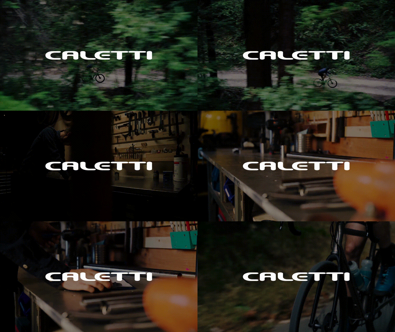
Project | Caletti Cycles Website Design
SCOPE:
WEB DESIGN, BRAND DESIGN
ROLE:
DESIGN DIRECTOR, DESIGNER
YEAR:
2023 - IN PROGRESS
PROJECT COLLABORATORS:
PER JERNER (VIDEO), OFFSITE STUDIO (COPY)
TOOLS USED:
FIGMA, WORDPRESS, AFTER EFFECTS, LOTTIE
LINK:
Caletti Cycles is a bespoke bicycle builder based in Santa Cruz, California. It is the passion and craft of one John Caletti, who hired me for this project.
With a legacy spanning back to 2005, John's dedication to precision, methodical processes, and unwavering attention to detail has not only elevated his creations but also earned him a revered status within the biking community.
Entrusted by John himself, I embarked on this project with a vision to redefine Caletti Cycles' online presence. Recognizing the immense power of storytelling within a digital landscape, I aimed to reimagine the web experience. My goal was to transport visitors into a realm where they could envision their dream bicycle and grasp the profound dedication and intricacy inherent in every Caletti build.
The objective? To create an immersive digital narrative that encapsulates the essence of Caletti Cycles, enabling enthusiasts to not just browse, but to feel, dream, and appreciate the artistry behind each meticulously crafted bike.
In initiating this project, I conducted extensive market research within the cycling and related industries (including apparel, fashion, and lifestyle brands) to gain insight into current trends and directions. Notably, over the past 5-10 years, there has been a significant expansion in the realm of "lifestyle cycling" brands such as Rapha, MAAP, and Pas Normal Studios. These brands have emerged as leaders, establishing new standards in brand design within this space. They emphasize elements of approachability, exclusivity, and a refreshing modern design ethos, setting them apart from many traditional apparel brands in the cycling sphere.
It's crucial to acknowledge that while Caletti isn't a fashion/apparel brand like Rapha (Unless John wants to offer a $300 jersey), these brands collectively signify a broader industry trend—an increasing emphasis on fostering a 'lifestyle' associated with cycling.
Throughout the redesign process, I concentrated extensively on contemplating the buyer's journey and how adopting a lifestyle-oriented approach could enhance the Caletti brand. The goal was to assist customers in envisioning their ideal bike and how it integrates into their lifestyle. This approach aimed to create a more immersive and engaging experience for potential buyers.
⏺ EARLY WEB RESEARCH IN FIGMA

⏺ CHOSEN TYPE SELECTION
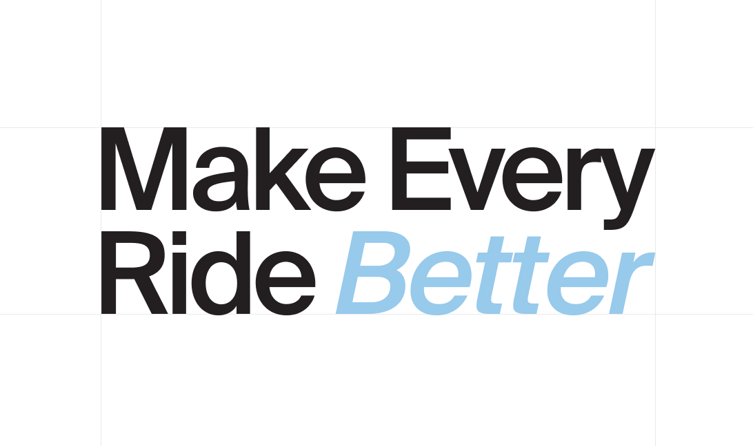
Collaborating with Offsite Studio on copy direction led to the decision to adopt the brand statement "Make Every Ride Better" In initial discussions with John, I highlighted the potential for a typeface refresh, noting a lack of distinctive character in the existing selections. Subsequently, I dedicated significant time to researching various typefaces and crafting type layouts to refine our vision.
Initially, the choice leaned towards an all caps condensed aesthetic. However, after allowing this direction to develop over a week or two, I pivoted towards a sentence case style inspired by Swiss design principles. This shift resonated well with John's preferences as well.
⏺ CUTTING ROOM FLOOR - TYPE / HERO SELECTION

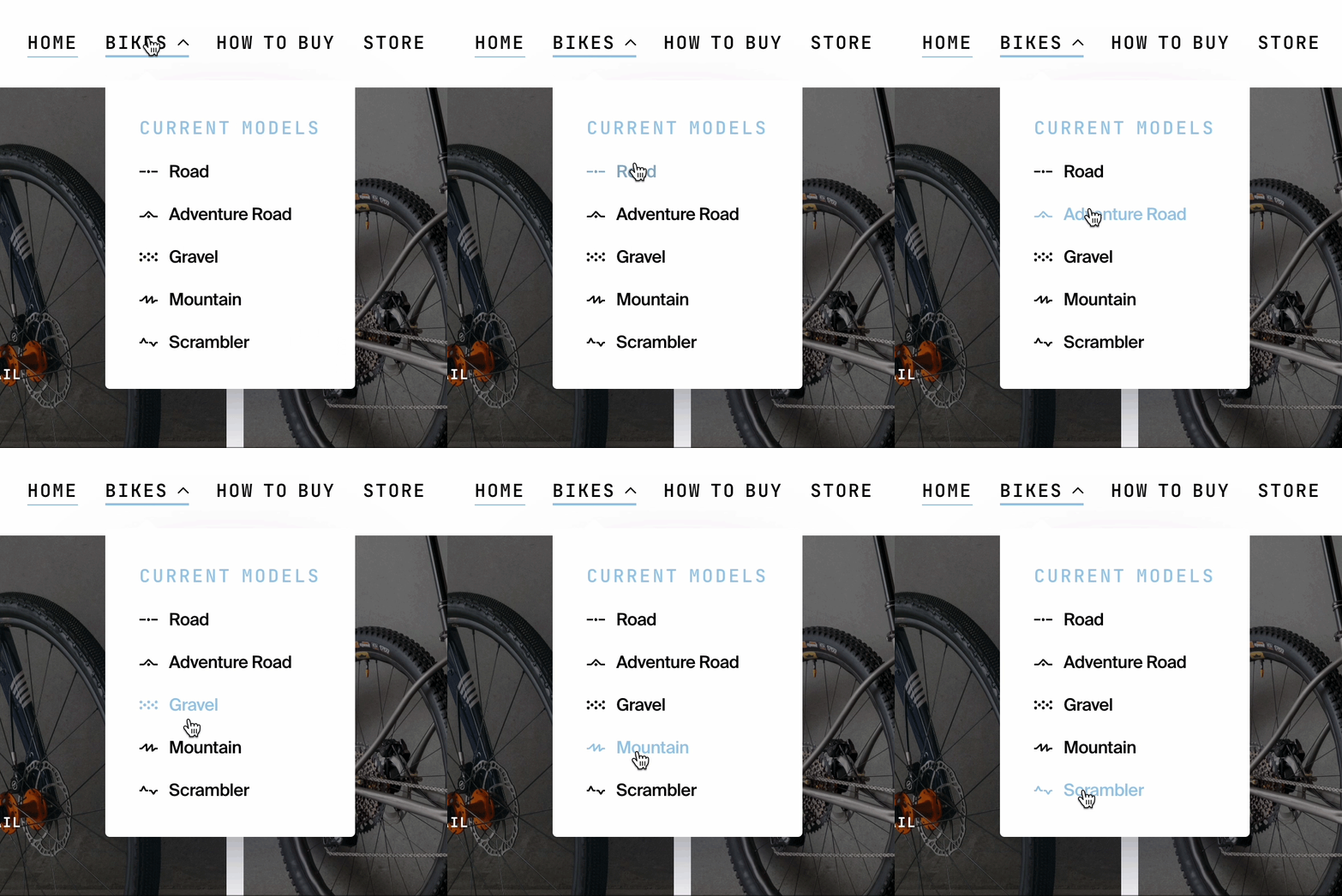
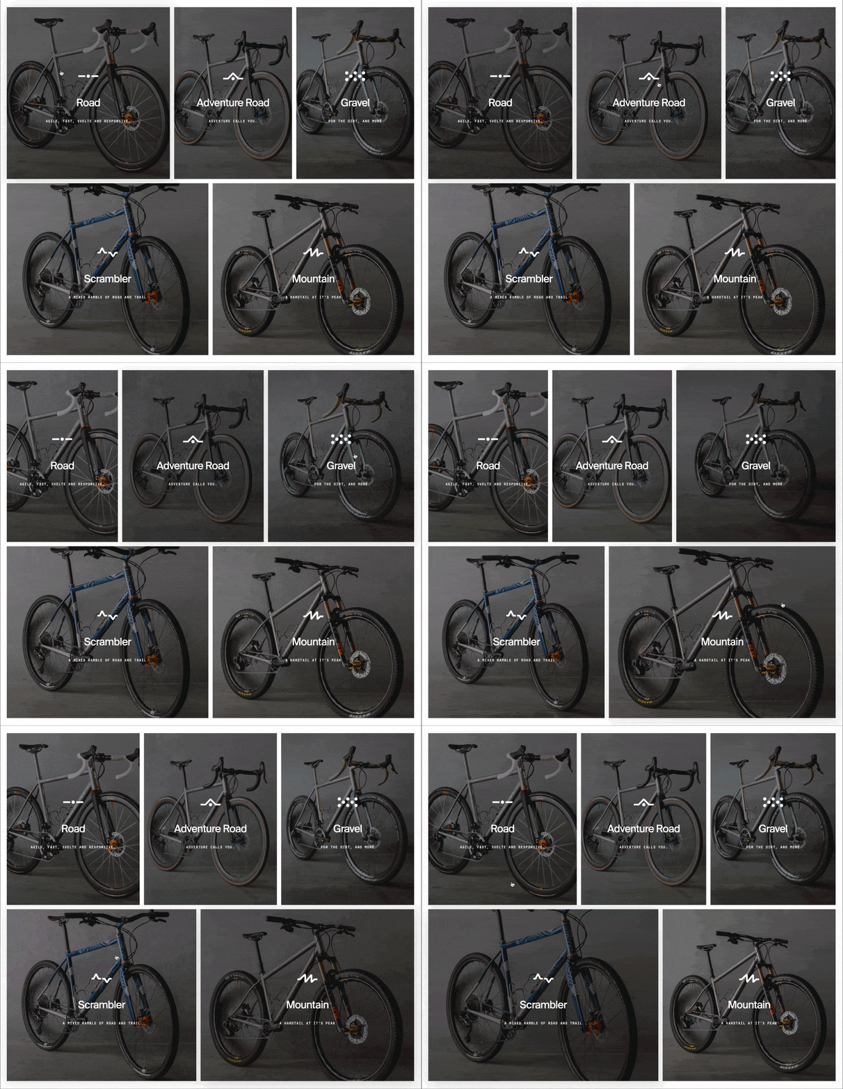
I also conceptualized distinctive icons to symbolize the various bike types crafted by Caletti. Each icon embodies the essence of the terrains these bikes are expertly tailored for. These minimalist yet evocative symbols were integrated across the website, strategically aimed at fostering a profound sense of connection and recognition among repeat customers and potential buyers. The intent was to establish a visual language that not only distinguished each bike type but also resonated deeply with enthusiasts, forging a lasting impression and facilitating an instant understanding of the specialized purpose behind every Caletti creation.
⏺ BIKE NAVIGATION
⏺ BIKE SELECTOR
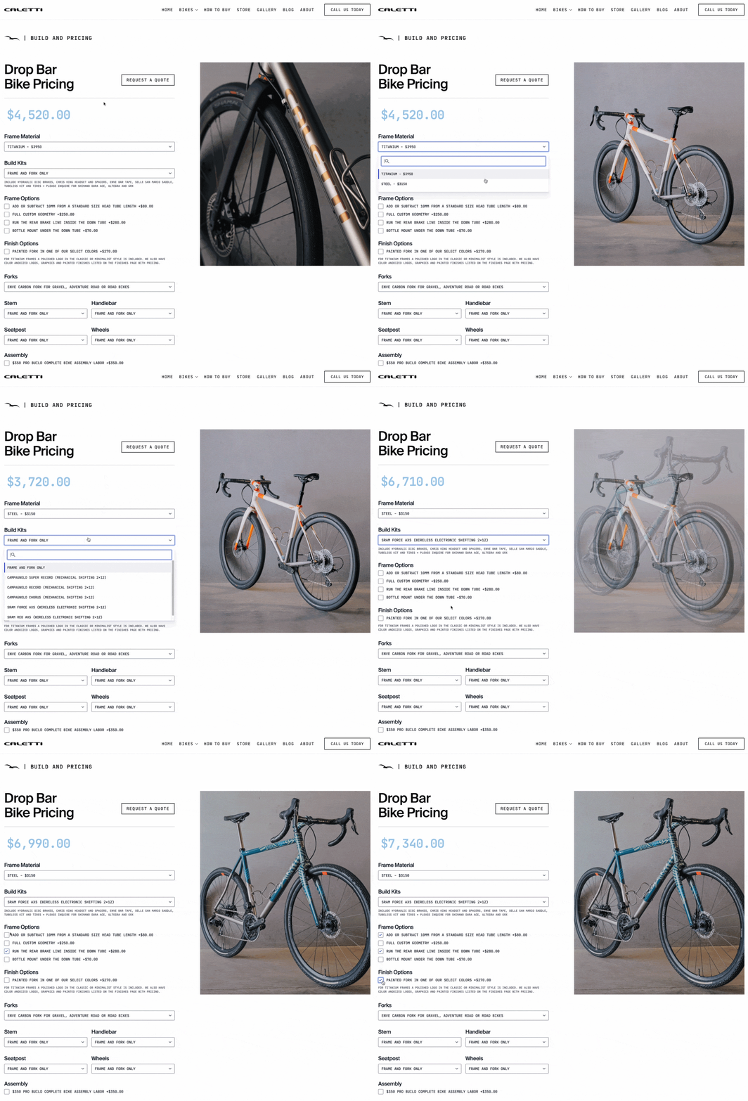
⏺ PRICING FORM
One More Thing...
As I delved deeper into understanding the buyer's journey with Caletti, I recognized the need to offer individuals a seamless way to customize their bikes before engaging with John. The current pricing page on the website presented a lengthy list of parts with corresponding prices, lacking interactivity. To address this, I devised a solution by crafting a tailored form embedded with intuitive logic. This dynamic form enables visitors to effortlessly select their preferred parts, options, and components directly on the site, generating an estimated cost in real-time. Once finalized, the chosen specifications can be conveniently forwarded to John via email, empowering him to proactively prepare for discussions with prospective customers. This feature is optimally responsive, catering equally well to mobile users.
I consider this implementation a significant triumph for the site, envisioning it as a pivotal element in enhancing customer engagement and retention. By facilitating a platform where potential buyers can envision and tailor their dream bike builds, I anticipate a substantial positive impact on the overall user experience and conversion rates.
I am really pleased with the direction and current outcomes of this project, and I am eager to get the site live to the world. Hopefully this gives you some perspect on my design and thought process!
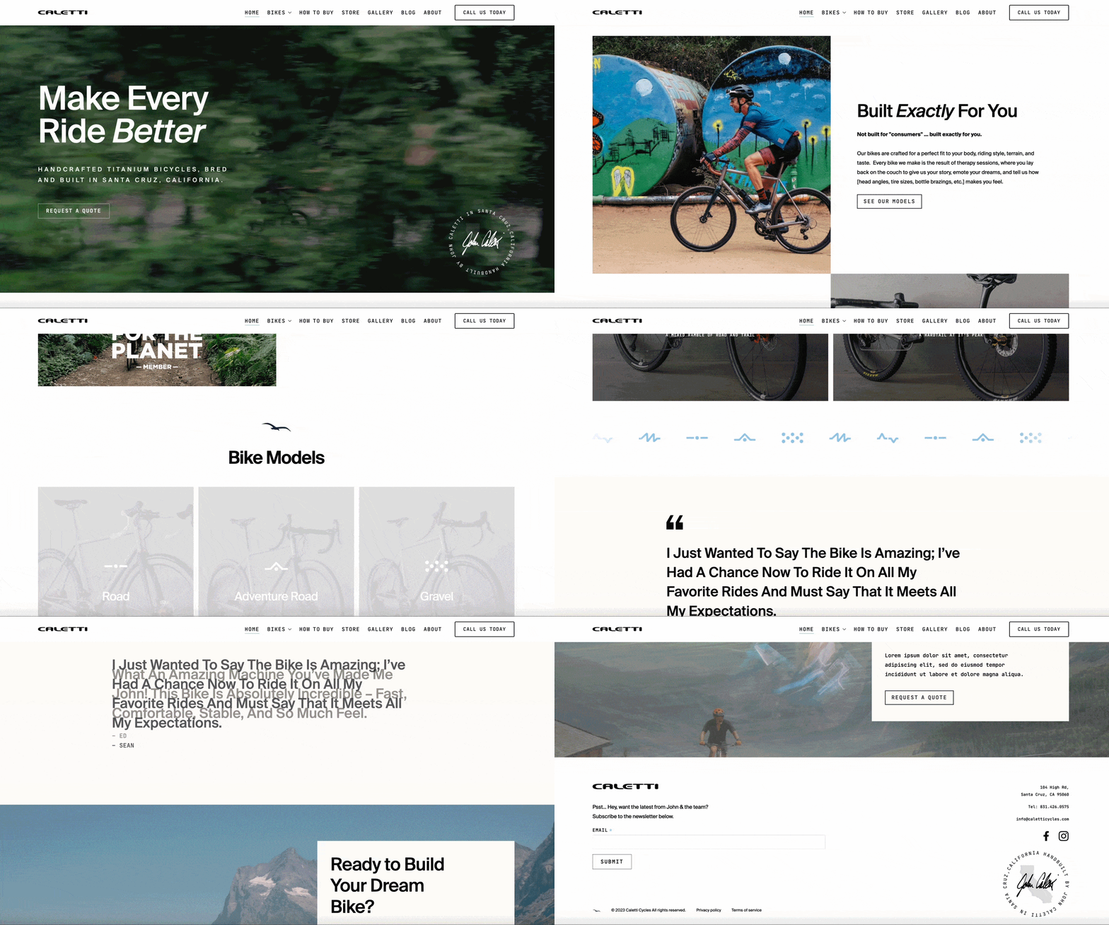
⏺ BEFORE AND AFTER

Let's work together.
I am open for opportunities in the SF Bay Area, Santa Cruz County, or remotely. If you are interested, i'd love to chat!
GET IN TOUCH
